Misinterpreted, or rather, differently interpreted, descriptive words are the source of many of our hours-long meetings. We spend these meetings trying to get on the same page about what a “trendy, dynamic logo that pops” looks like when a client is unhappy with what we deliver. The problem with these words? They’re open to interpretation. A vast, wide, macro-chasm of interpretation that design goes to die.
Descriptive Word Pitfalls
We run into one of two problems when people use vague descriptors. The first one is the client has no idea what they’re asking for or what they mean when they use these words. All they know is what they’re looking at isn’t it.
The second: the client knows exactly what they want – they have the image in their head – but doesn’t know how to ask for what they want in a way that doesn’t leave a ton of room for the artist’s interpretation.
Understandably enough, this leads to frustration on both sides.
Describing Existing Design Vs. Not-Yet Existing Design
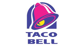
The connection happens here: when you look at the 1990s Taco Bell Design, you can say “oh wow, that logo pops.” Most everyone around you knows what you mean because they’re using a bright purple that “pops,” as well as a 3-D image of a bell that also literally “pops” (see below).

When you say, “I like how large the image is against the smaller typography; it feels really dynamic,” about a design, people understand what you mean because they’re looking at it.
However, when you say “I want it to pop” about a nonexistent design, and no one else can see your mental image (or is trying to interpret something you don’t understand either), that can actually mean…literally anything.
We’ll explain a few of our trouble descriptors and why they cause problems below.
Descriptive Words That Are Unhelpfully Vague
Pop
This was touched on above. So many things can make an image “pop.” Are you asking for high contrast? Are you asking for a huge image that will stand out against smaller text? Bright colors, drop shadows, pop art, 3-D images. We’ve had clients have each one of these in mind when they said “pop” and were unhappy when they got a different interpretation proofed out to them.
What does a logo that “pops” mean to you? It may require some internal work, but we can’t read your mind. If you want a 3-D logo, it would do you better to just ask for that. That way you don’t get one that’s lime green and purple. Then you’re upset that it doesn’t “pop” to you, when it absolutely does pop based on a previous-client’s definition of the word.
Trendy
Yikes. This descriptive word is hard because trends change so quickly and vary widely between contexts and industries. What is trendy in real estate right now is obviously not what is trendy for Instagram influencers. What was trendy two years ago may not be trending today. It’s unreasonable to expect your designer (who is working with its own industry’s trends) to understand the trends in your field or what you mean by that word.
What some of our clients have actually meant when they initially said “trendy:” modern, youthful (look at the VSCO girl aesthetic), bright, and geometric. If you want a trendy design, you’ll need to look at what makes it trendy to you, and convey that to us.
We had a client come in extremely frustrated that we weren’t adequately providing an “edgy, trendy” design to her. What was wrong with it? She didn’t know. What could we do to fix it? She didn’t know. What was she picturing when she said edgy? She didn’t know.
After two hours we finally hit the Google machine and Pinterest for designs she liked and felt fit what she had in mind. What was the look she was going after?
Farmhouse.
We’ll let you do with that information what you will. Everyone means something different when they use these descriptors.
Dynamic
This descriptor is the worst for us in terms of success. In our experience, it’s also the word people use most when they don’t know what they want. But if you think about it, especially in regards to a design that doesn’t exist yet, what does this word even mean? When we ask our clients what they would like us to do to make something more dynamic, we always get deer-in-the-headlights.
The definition is 1: (of a process or system) characterized by constant change, activity, or progress.
or 2: (of a person) positive in attitude and full of energy and new ideas.
We need you to tell us how either of these actual definitions applies to what you have in mind. You’ll need to provide actionable words for us to make it dynamic according to what you have in mind. It’s just a numbers game; we will never guess the right way to make something dynamic for you.

How to Come Armed with Helpful Descriptors
The key is to do a bit of soul searching. Pull together a bunch of designs you like and figure out what they all have in common. The answer won’t be as vague as “they all pop.” It will be something like “they’re all in this color scheme,” or “they all have geometric shapes.” Now you’ll know that to make your logo pop according to your desires, you want geometric shapes in a certain color scheme.
Most trends are named (ie. farmhouse). Instead of saying a broad word like “trendy,” dial down which trend you’re asking for. If we don’t immediately recognize what you mean by industrial chic, a quick Google will quickly have us on the right path.
Ask yourself “What does (blank) mean to me?” What characteristics feel dynamic to you? Pick out a design that you would describe as dynamic, then put into words what you like about it. Use those words to explain to us what you’re looking for. Bonus points if you bring us the inspiration piece to explain what you mean.
Speaking of, you’re always welcome to bring examples to the meeting. If you’re still having a hard time nailing down exactly what you want and the descriptive words to describe it, bringing us examples of things you like will help give us a visual. If the designs you like are unfocused and you like a lot of things across multiple clashing designs, we’ll help you narrow down a lane and commit to it.
The Bottom Line
Some descriptors are, frankly, lazy. The key to communicating clearly with your designer and getting a design you love is to dig a little deeper for descriptors we can do something with. If you’re ready to start, or if you need help choosing a lane, give us a call. We love this part.